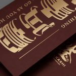
Henderson Red Packet Design 2020
client
HENDERSON
01. Illustration /
02. Packaging /
03. Visual & Graphics /
about
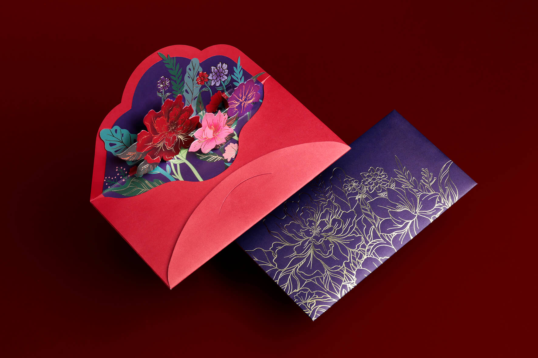
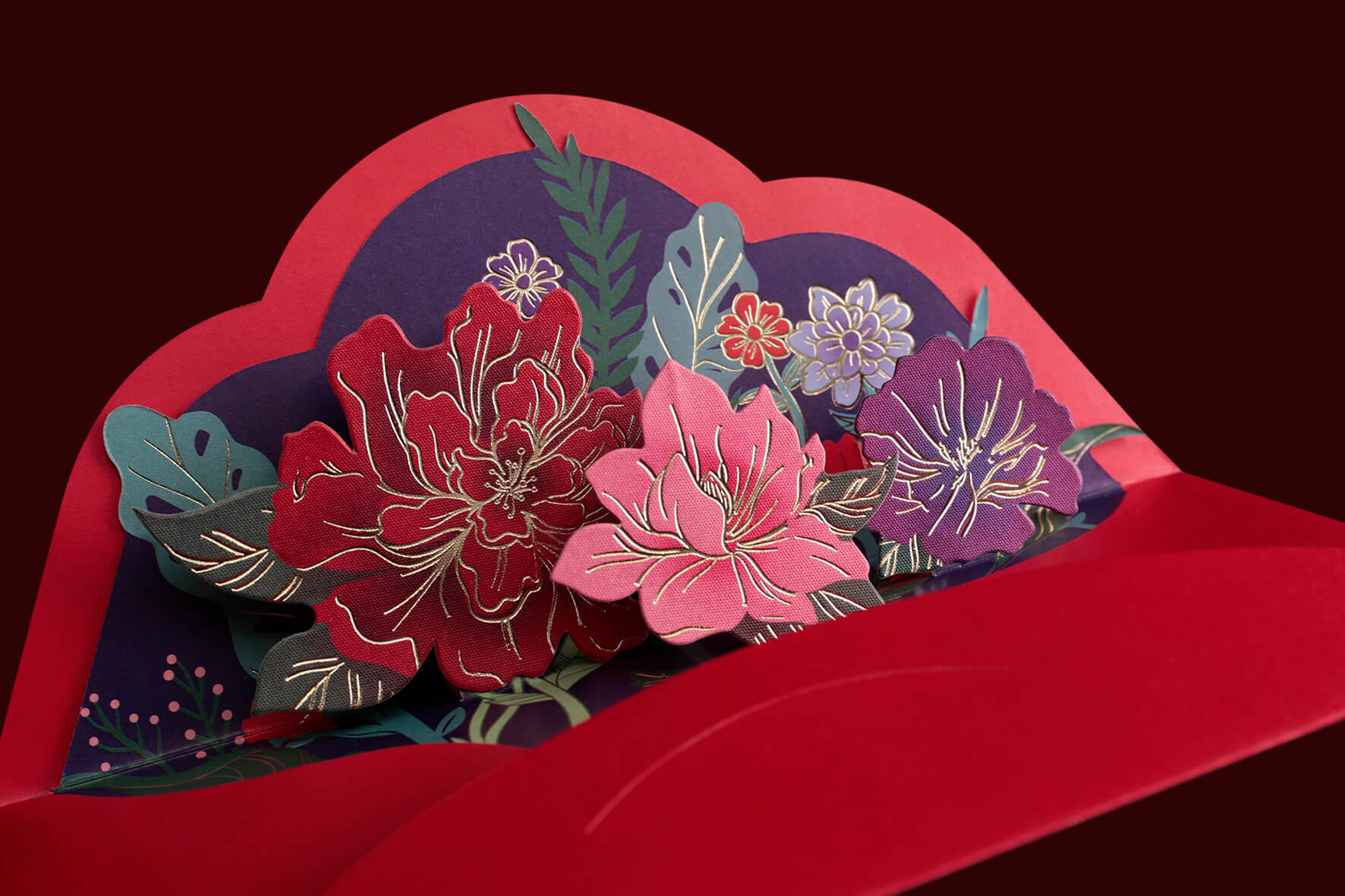
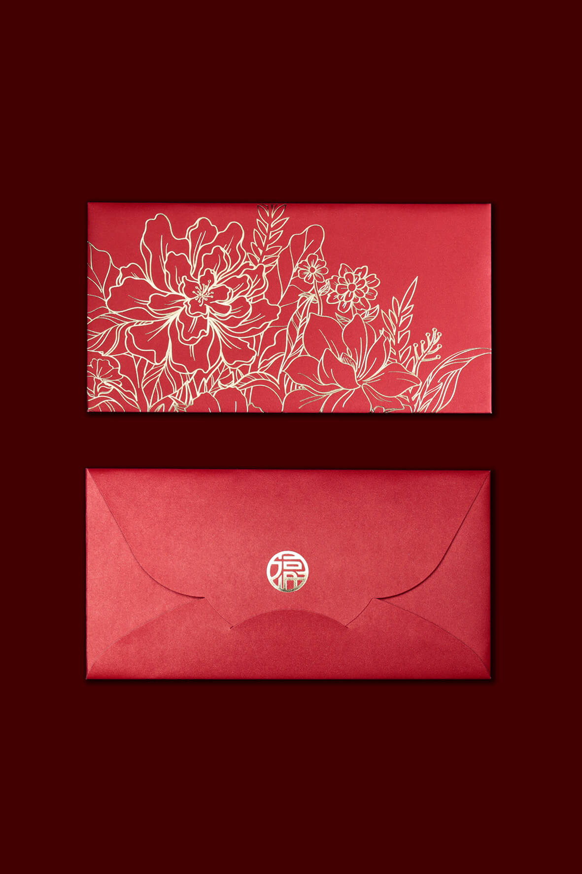
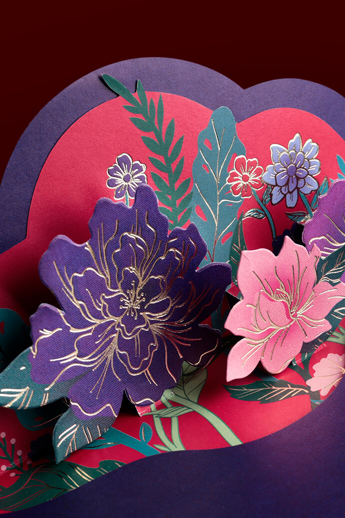
The Red Packet “Lai See” and gift box was designed for the shopping malls under Henderson Land Development Co. Ltd. .We used the peony (Moutan) ,one of the most representative flower in New Year, as the corporate elements, with the colour of red and purple which represents “The Happiness” and “The Prestige”. A pop-up gimmick was also designed at the back, implying the meaning of “Hundred Flower Blooms”, which provides a freshness feeling from common red packets.
關於
Count to Ten為恒基兆業地產有限公司旗下商場設計2020年利是封及禮盒套裝。利是封選用經典的牡丹花作為設計靈感,主體用上分別代表喜慶的紅色及尊貴的紫色,並以燙金牡丹盛放圖案為主題。背面則運用立體賀卡手法,打開利是封隨即可見立體牡丹圖案彈出,展現出百花爭艷的美感,並藉此希望擺脫利是封沉實的設計,於云云利是設計突圍而出。
Creative Concept | Count to Ten
Art Direction | Count to Ten
Photography | Count to Ten
Packaging Design | Count to Ten
