ALIVE 2020
client
ALIVE
01. Visual Identity Design /
02. Logo Design /
03. Visual & Graphic /
04. illustraion /
05. Photopgrahy /
about
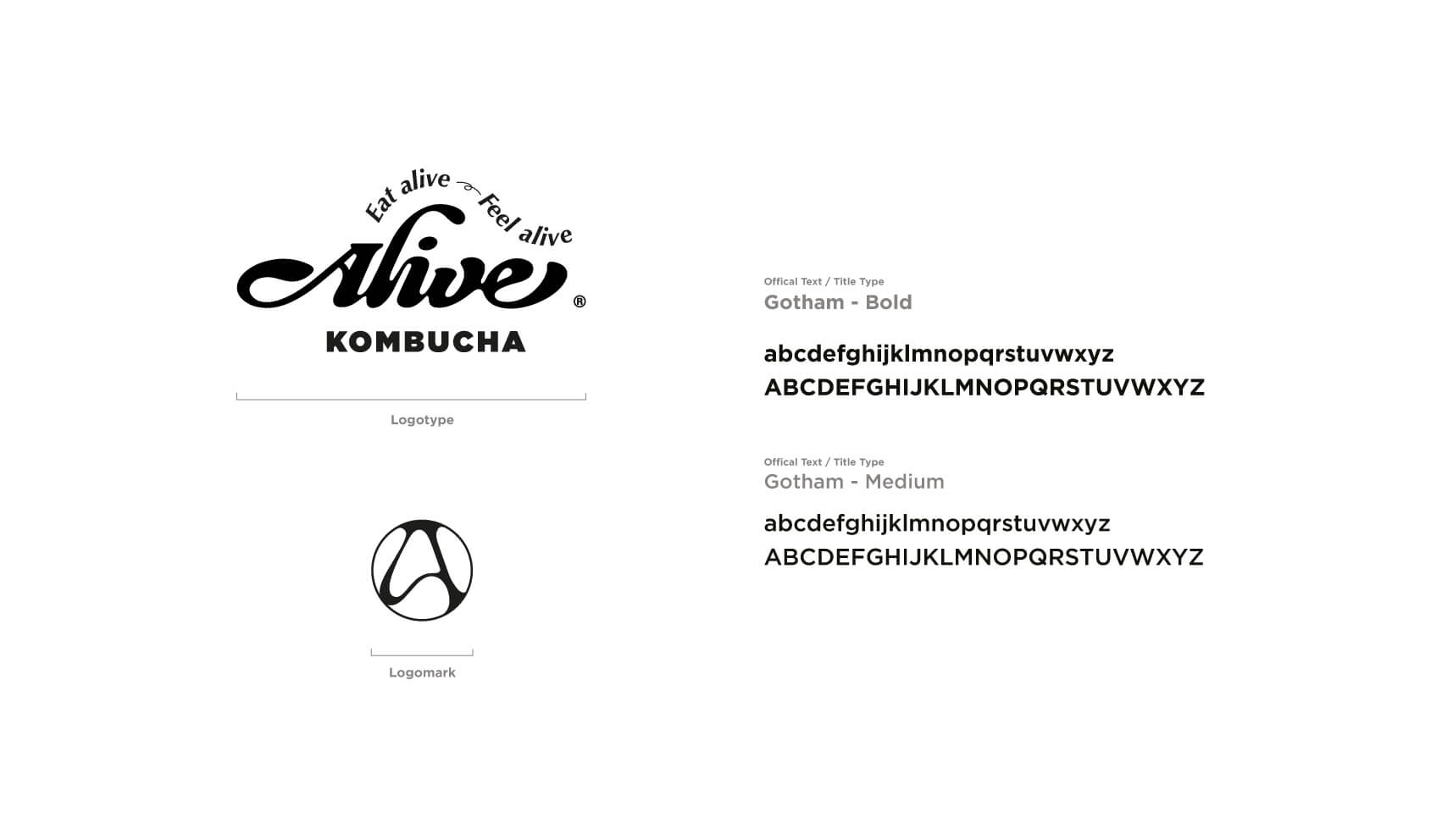
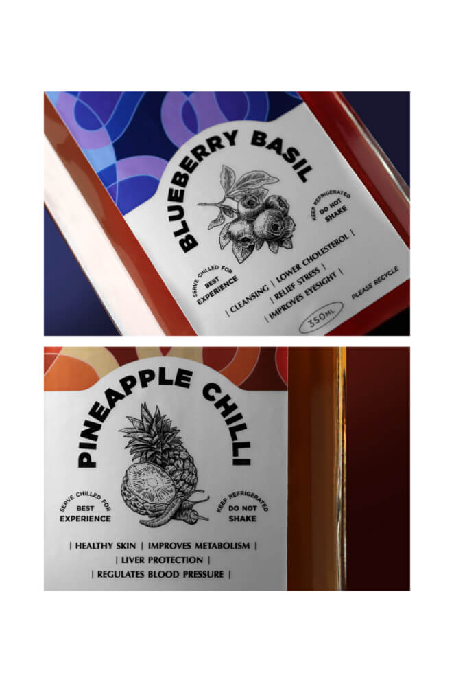
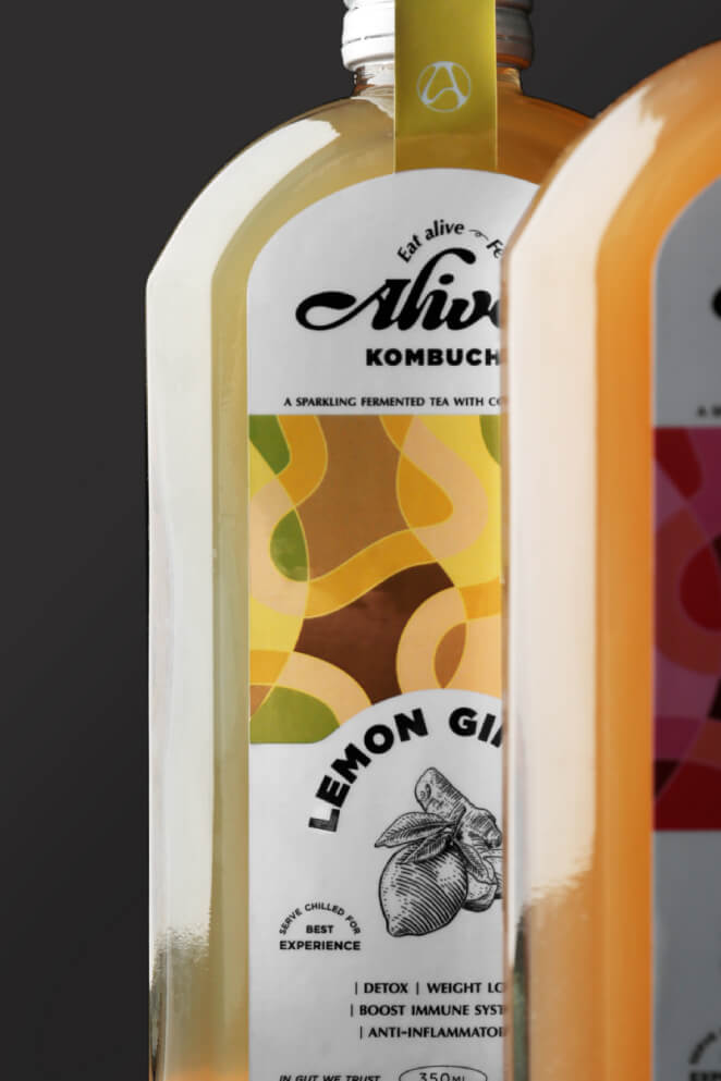
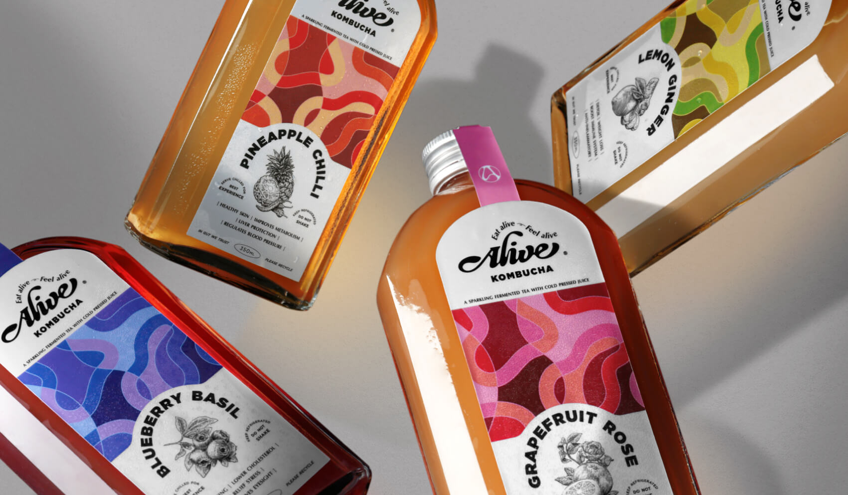
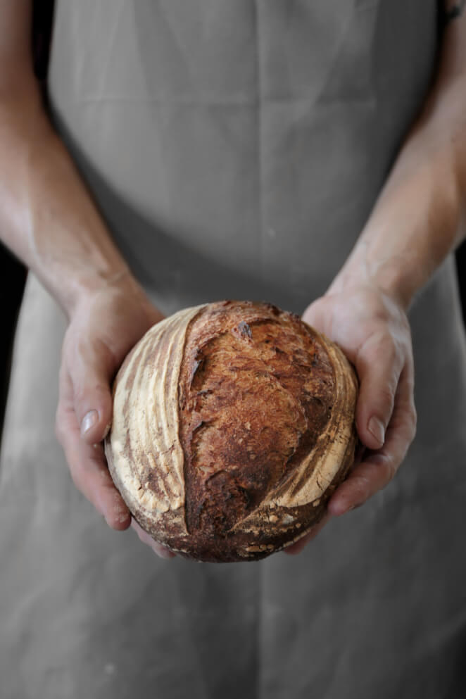
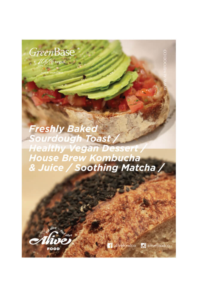
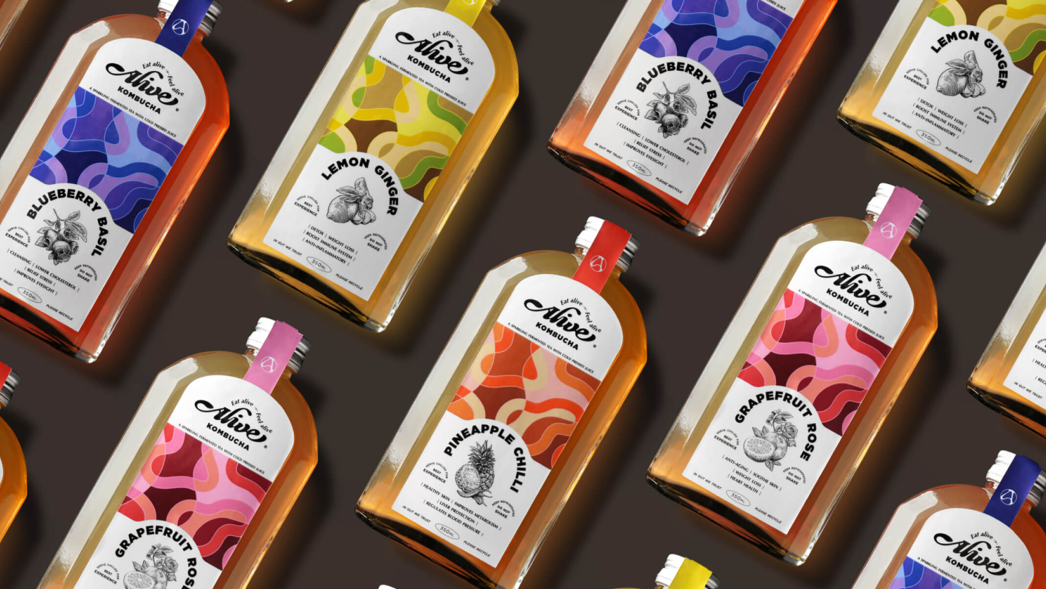
Alive Food Co. focuses on the deliciousness and healthiness, with a series of natural and fermented foods such as hand-made sourdough bread and Kombucha. Count to ten is responsible for building the brand’s corporate identity system and visual identity design, including brand logo design, product packaging design with photography, and commercial photography. The design concept of the logo is based on the letter 「A」 which represents the brand name 「Alive」, and the lines of the letter 「A」 are curved to represent the bubbles produced during the fermentation process. The usage of white and silver as the main colour of the brand emphasizes the brand’s pursuit of natural and additive-free philosophy, the two colours are also easy to match with other colors. With the wide usage of different colors pattern, which adding a unique vibrancy to the brand.
關於
Alive Food Co. 主張追求美味之餘也注重健康,主打純天然手工製作之酸種麵包及康普茶等發酵食品。 Count to ten 負責建構品牌的企業識別系統及視覺識別設計,包括品牌標誌設計、產品包裝設計及攝影、商業攝影等。標誌以代表品牌名稱「Alive」的「A」字作為設計概念,並將A字線條以曲線進行變化,代表進行發酵過程時所產生的氣泡;產品主體色調則運用白色及銀色,除反映出品牌追求天然、無添加的理念外,白色及銀色亦易於與其他顏色進行配搭,豐富的色彩運用亦令品牌增添一份獨特的生氣。
