HENDERSON BROCHURE 2020
client
HLD
01. Visual & Graphic /
02. Brochures Design /
about
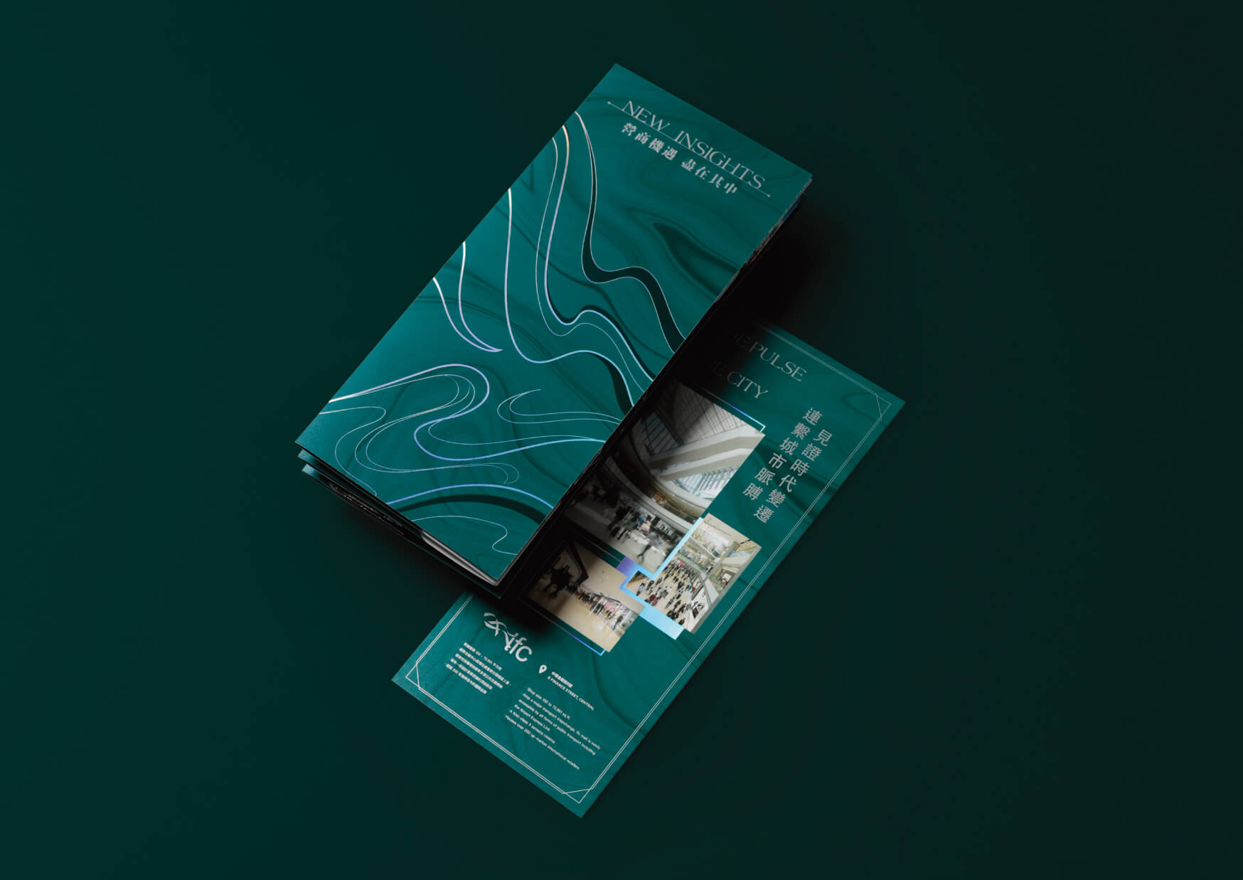
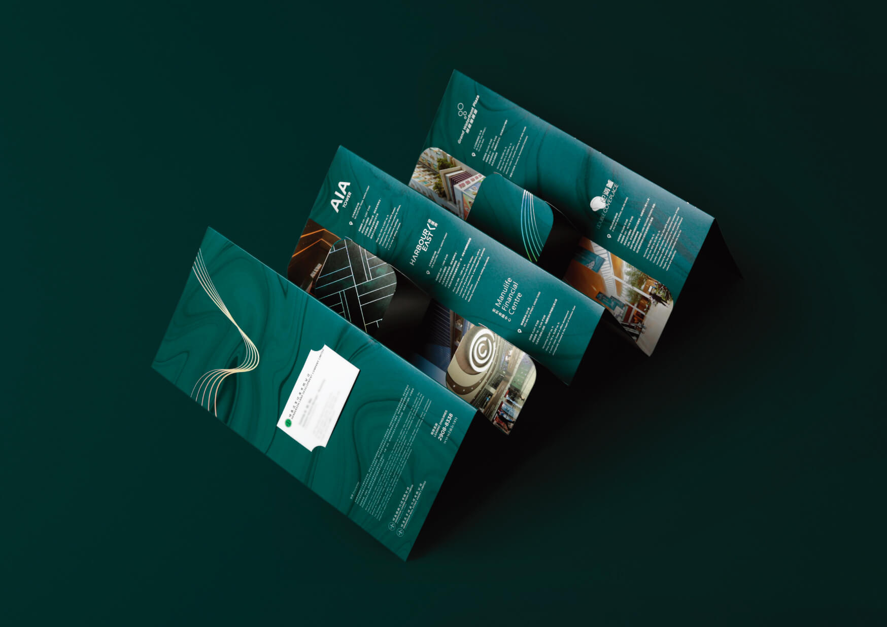
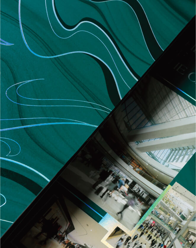
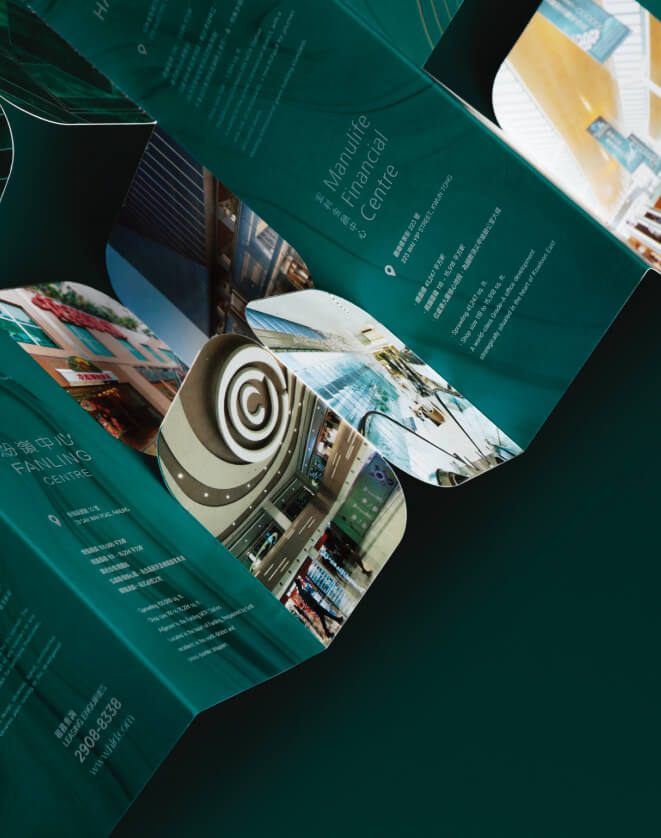
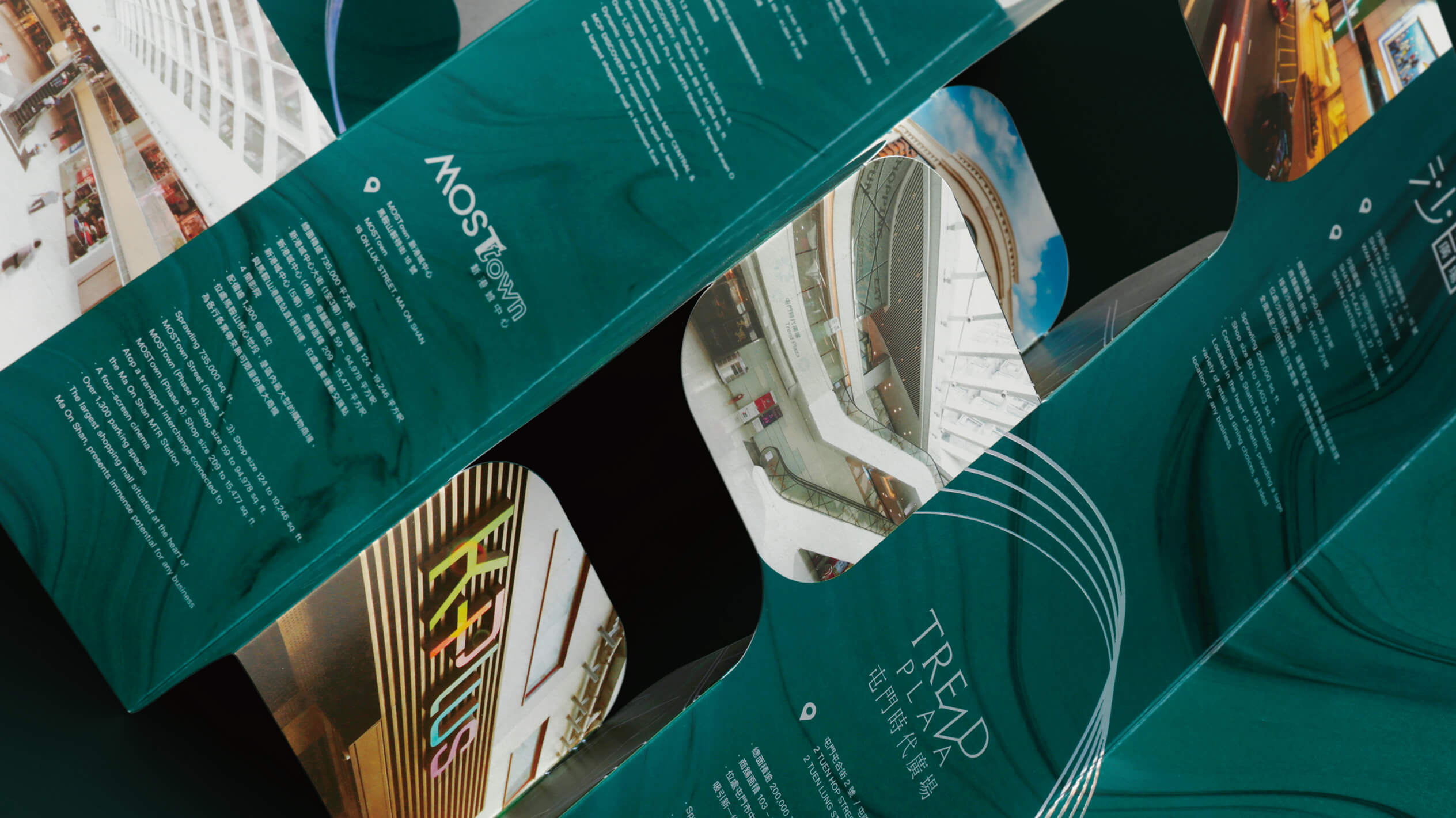
Count to Ten designed commercial brochures for Henderson to present client properties and shopping malls from a new perspective. The design is inspired by the continuous flow of water, and the curve is used as the main expression. It means that after years of continuous development, the client’s properties have integrated into the society and become a part of the people’s life; the design also particularly adds the illusion effect to the main line , Which symbolizes the endless stream of water reflecting the sunlight, showing colorful colors, bringing a colorful life to the public.
關於
Count to Ten 為恒基兆業地產有限公司設計商用宣傳小冊子,以全新角度演繹客戶旗下物業及商場。設計以連綿不斷的流水作為靈感,運用曲線作為主體表達,並以大理石紋路圖案作背景,豐富整體構圖及設計,寓意經過多年來不斷發展,客戶旗下物業融入社會,亦是一道堅強後盾,成為大眾生活的一部分;設計中亦特別於主體線條中加上稜鏡幻彩效果,象徵川流不息的流水將陽光反射,展現出幻化七彩顏色,為大眾帶來多姿多彩的生活。
Visual & Graphic | Count to Ten
Brochures Design | Count to Ten
